design
Popovers
Present a list of actions in a limited space.
Usage
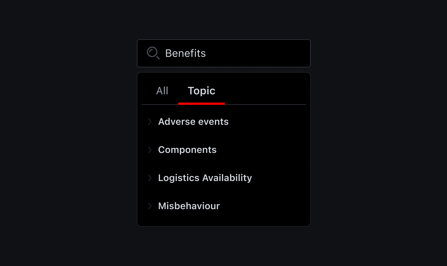
The popover is a versatile component that can be employed in different contexts with different purposes. Popovers can be efficiently used as:
- Command menus, which offers a series of contextual actions based on the selected trigger
- Navigation menus, which lead users to a new page or screen
- Attribute selection, which lets users choose a value from a list of possible values
Considerations
- Please keep in mind that when using a Popover, you're making a tradeoff on the discoverability of the actions for the users (they're hidden under yet another click)
- It is best practice not to use a popover if there are two options to choose from. In this case, use radio buttons instead.
- Do not nest popovers or use them to display overly complex information. Keep option selections as straight forward as possible.
- Consider using a select if most of your experience is form-based or frequently used on mobile platforms. The native select works more easily with a native form when submitting data and is also easier to use on a mobile platform.
- In general, try to avoid drop-downs when there are more than 10 or fewer than 3 options
When not to use
As for selects only, you should also avoid using them when specific info or data:
- are particularly familiar to the user (e.g. birthdate)
- could be determined automatically (e.g. card type)
- are faster to type than to search and select (e.g. country)
Often the better option could be a text field with some data validation (e.g. credit card expiring date). Other examples that fit this case are titles, states, regions, shipping methods selection, and so on.
Popover vs select
Even though Popovers and Selects share similar functionalities, they are actually behaviourally unique and satisfy different use cases:
- When you choose something in a select, the value of the select trigger represents the option chosen. When you choose an action in a popover, by default the trigger label doesn't change (but it could be implemented)
- Use a popover when you want to present a list of actions in a limited space. If you instead have a list of options for a particular value, like "city", select is the component for you.
- The popover can host all sort of custom components (eg: tooltips search box, images, etc)
- The native select is convenient on mobile: it uses the native control for the platform which makes it easier to handle.
Popover
- Design System styled
- Trigger actions
- Display some special content (tooltip, images, searchbox)
Select
- Styled by the platform being used
- Select 1 or more values from a list
- Better UX on mobile
- Better accessibility
- Out-of-the-box support for multi-select and category labelling
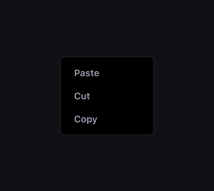
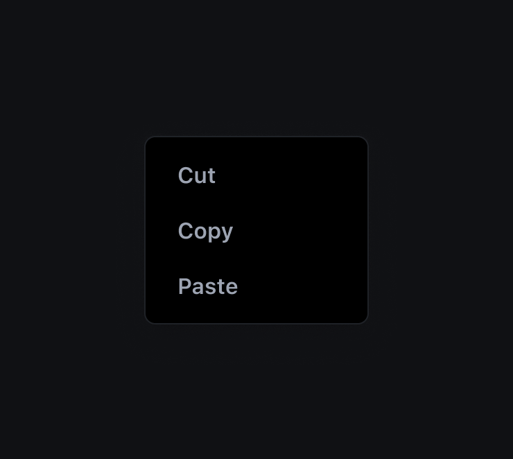
Order of items
Always sort the actions logically, following a familiar pattern. The most common are:
- Alphabetical order
- Numerical order
- Predictable or conventional pattern
Don't
Do
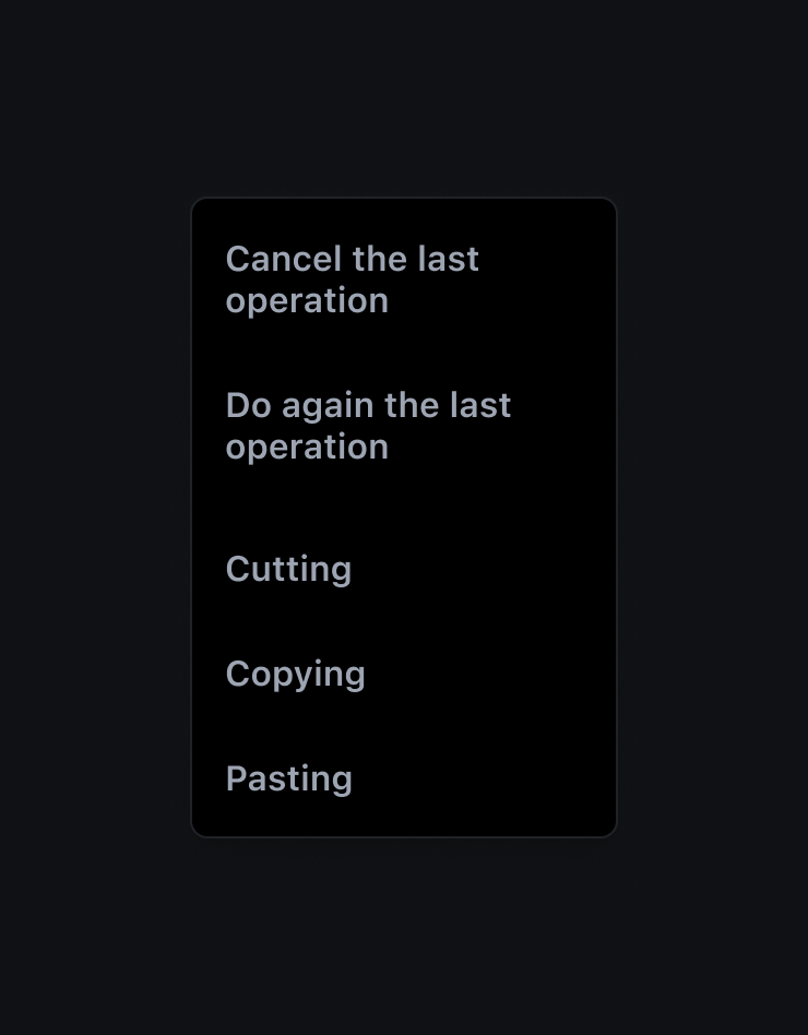
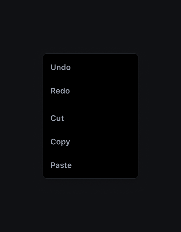
Writing labels
In writing labels for popover's actions, remember to:
- be informative but brief, accurate but immediate
- fit the action in a single line of text
- use present tense verbs for actions and nouns for links
- write them in sentence case to increase readability and scannability
- Do not use the same word or phrase at the beginning of a set of options.
- don't use articles
- If possible, group related actions together
Don't
Do
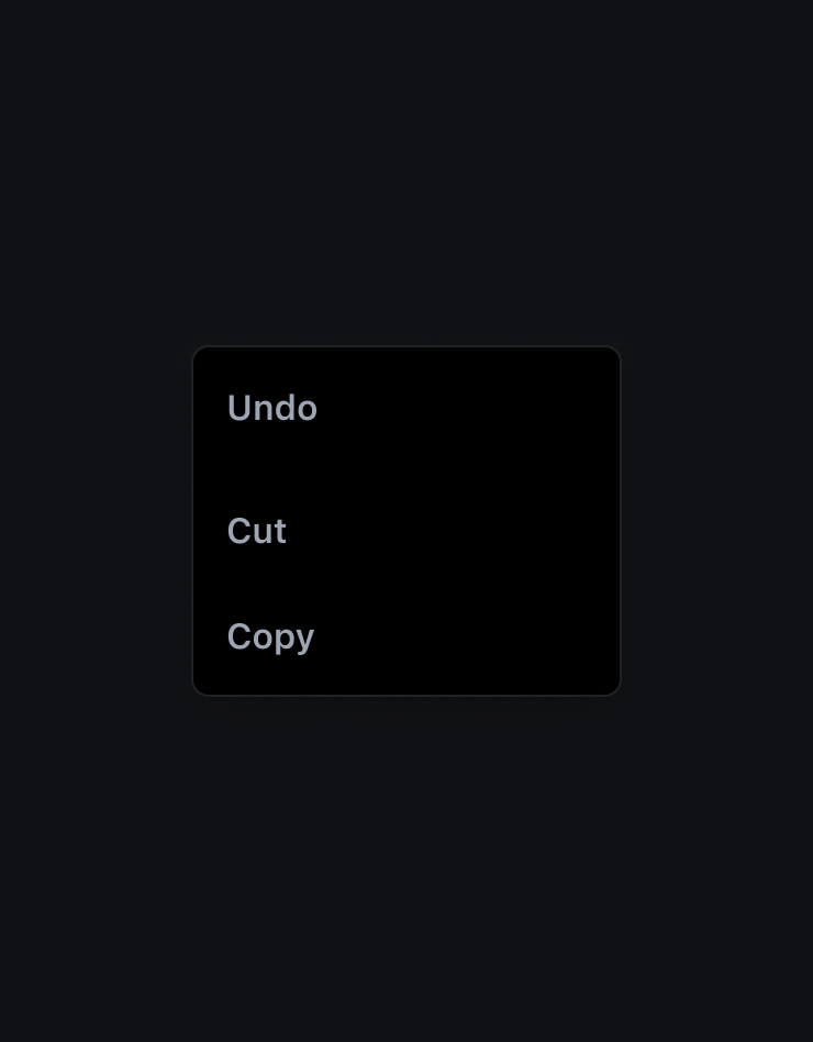
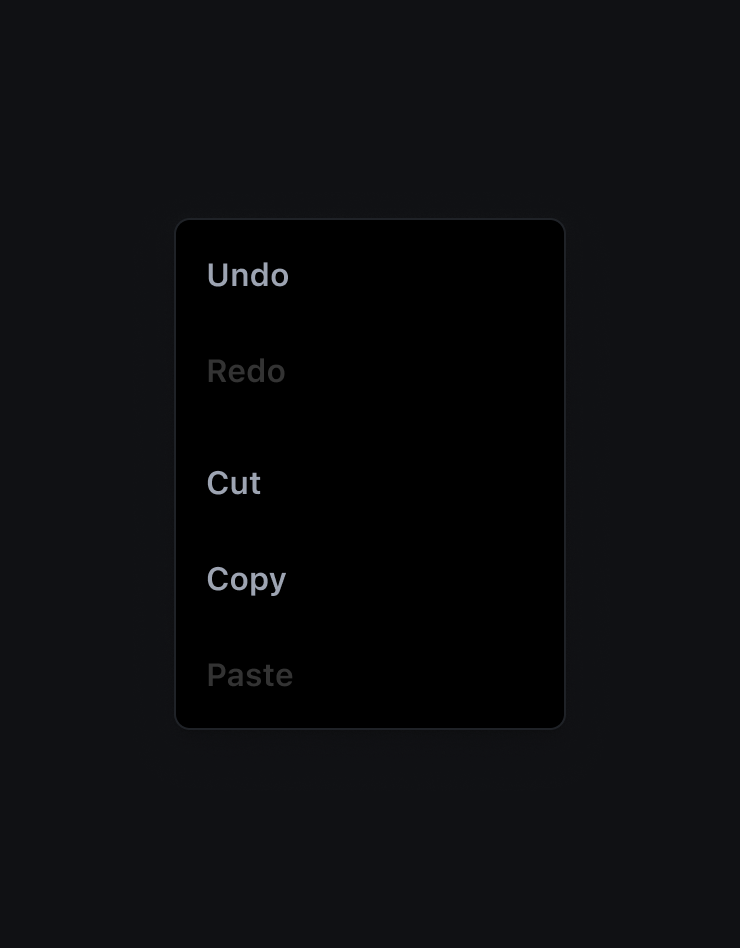
Disabled items
If an action can't be used in a particular moment or condition, display it as disabled rather than temporarily remove it from the popover.
Don't
Do
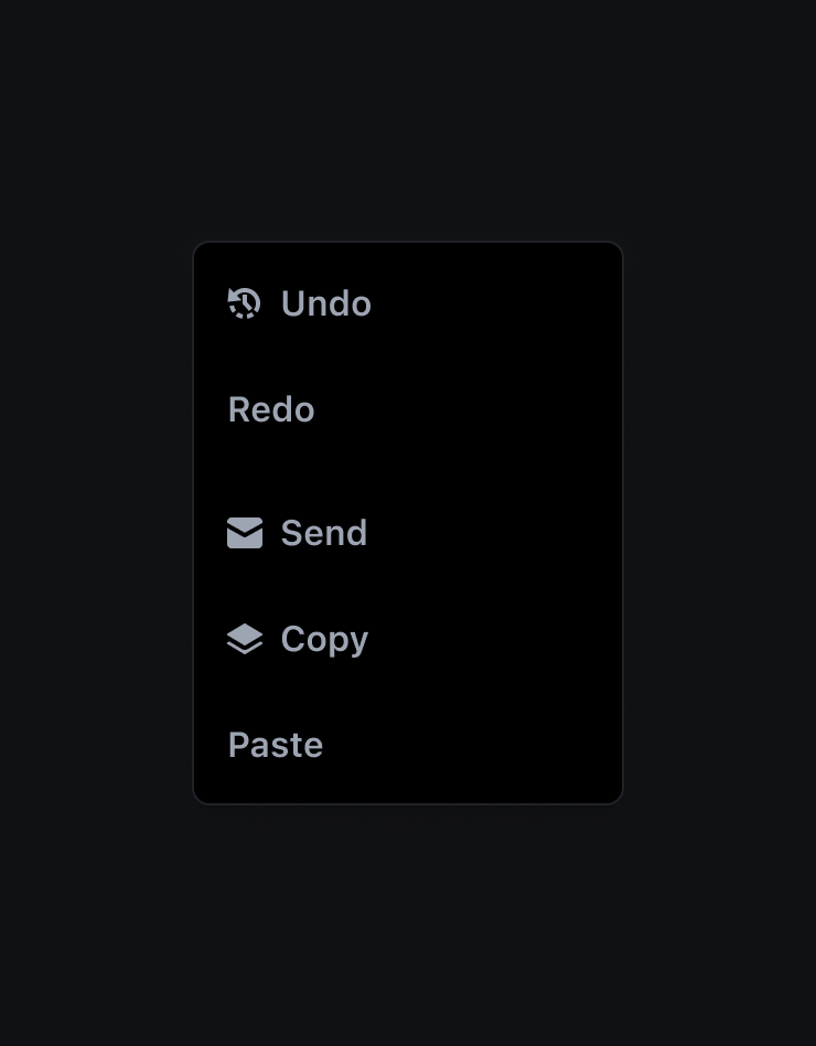
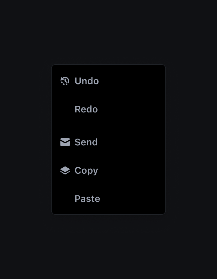
Items with icons
Popover items can have icons to enforce the action to be performed. It's important to keep the icon size in mind when designing the popover and avoid alignment issues when some items have icons and others don't.
Don't
Do
Adding Custom items
The popover components is highly customisable. Some common use case include adding a tooltip on popover items or inserting a search field, but the possibility are really broad
Behaviour
Auto placements
You don't need to deal with placement issue inside the viewport, because the component handle them by itself and adjust the position of the floating menu based on the most available space.
There are different preset that you can give to your component, but the auto, auto-start, auto-end are really convenient.
Elevation
The Popover has a default elevation of 2