design
Forms
Let the user talk with you.
Forms represent a crucial moment in the user experience. Although they allow us to collect the data we need to guarantee a smooth journey throughout the application, they are often undergone as an unpleasant gateway rather than a part of the experience itself.
Usually, the first thing a user does approaching a new form is scanning it and estimating how much time is required to complete it. The more complex a form looks, the more likely the user will abandon the process.
In this section, we will analyze the constituent parts that make up a form and how they should work together rather than cover all its specific components. This way, you would be able to create forms that won't cause pain to the users. They will integrate into the flow of their experience rather than abruptly interrupting it.
Structure
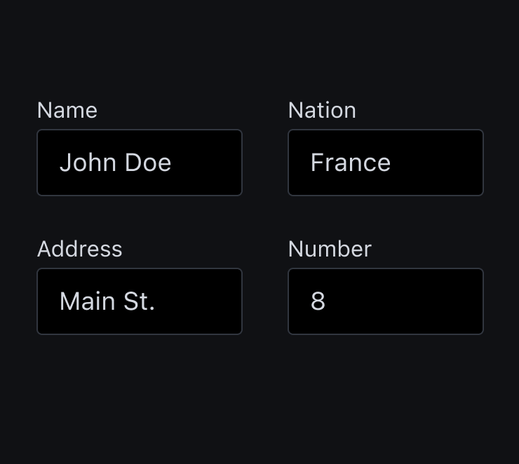
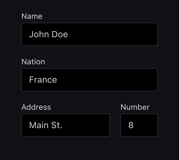
Users scan pages and screens, rather than read them. To facilitate this behaviour, it is advisable to use a single-column layout. Indeed, single-column forms are faster to complete than multi-column ones. However, it is possible to place short and logically related fields on the same row, such as for the city and zip code.
Don't
Do
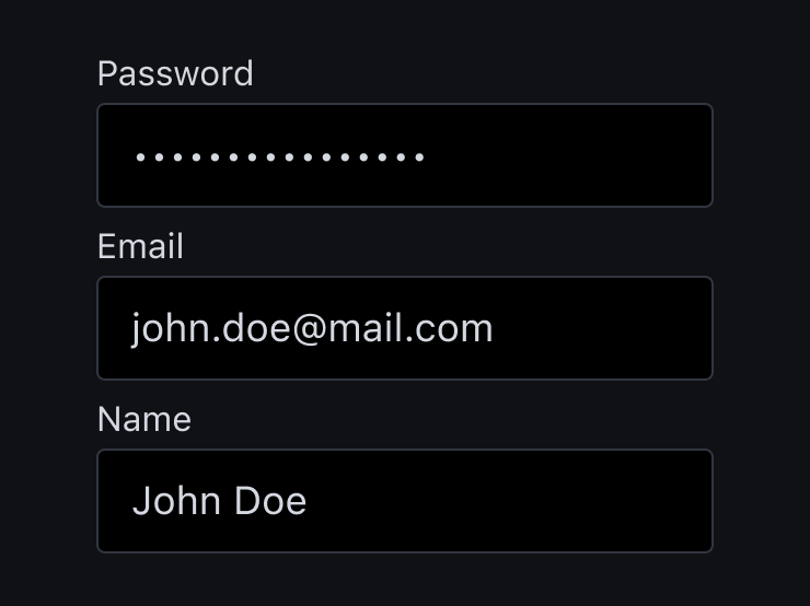
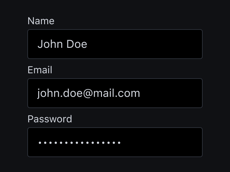
Try a create a sense of conversation with the user. Follow the rule "easy before difficult" and place in-depth or personal question last. Always explain why you are asking for sensitive information.
Don't
Do
If your form has several questions, group related ones into logical sections. Provide the right amount of white space between sections to distinguish them visually. Another way to make the form look simpler is to minimize the number of fields visible at one time, breaking long forms into steps.
Inputs and data
As mentioned before talking about the structure of a form, the golden rule for inputs is to minimize their total number. As long as you've collected the essential user's information, you can always follow up with a request for more data.
Optional fields
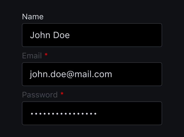
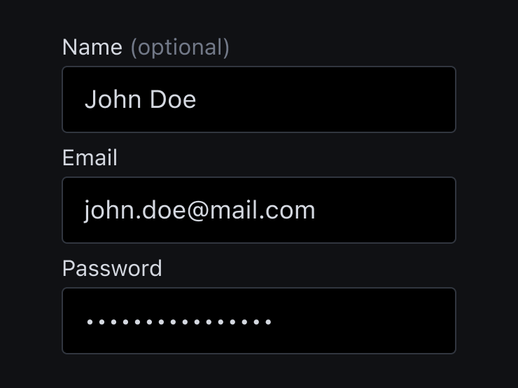
The number of optional fields in your form should be zero. If you still need to include a few optional questions, mark optional fields instead of mandatory ones using the "optional" label.
Don't
Do
Fields length
The length of an input field should be in proportion to the amount of information expected in the field. For example, fields such as area code and house numbers should be shorter than ones for the street address.
Don't
Do
Prevent errors
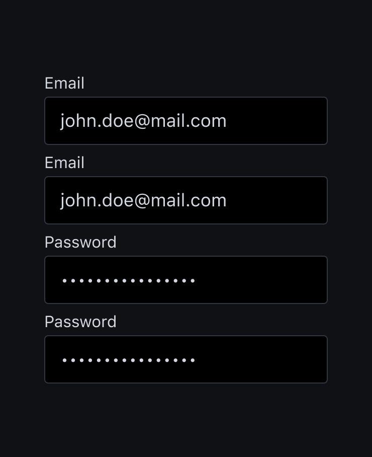
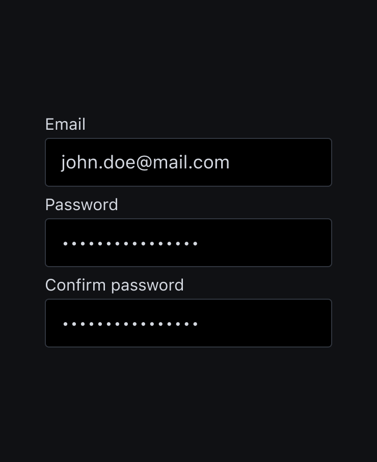
During data entry, users often copy and paste their email address from one field to another to avoid the effort of retyping it. Therefore, don't ask the user to repeat their email address twice to confirm it. However, this indication doesn't apply to passwords, it is always advisable to request user's confirmation throught retyping.
Don't
Do
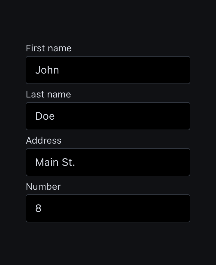
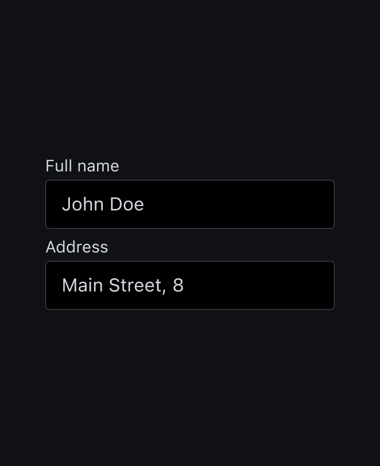
Aggregate fields
Where possible, don't slice fields if you're asking for full name, phone number or date of birth. Choose a single field and pair it with a placeholder to explain its formatting rules. You can also help the user by enabling auto complete and geolocalisation services.
Don't
Do
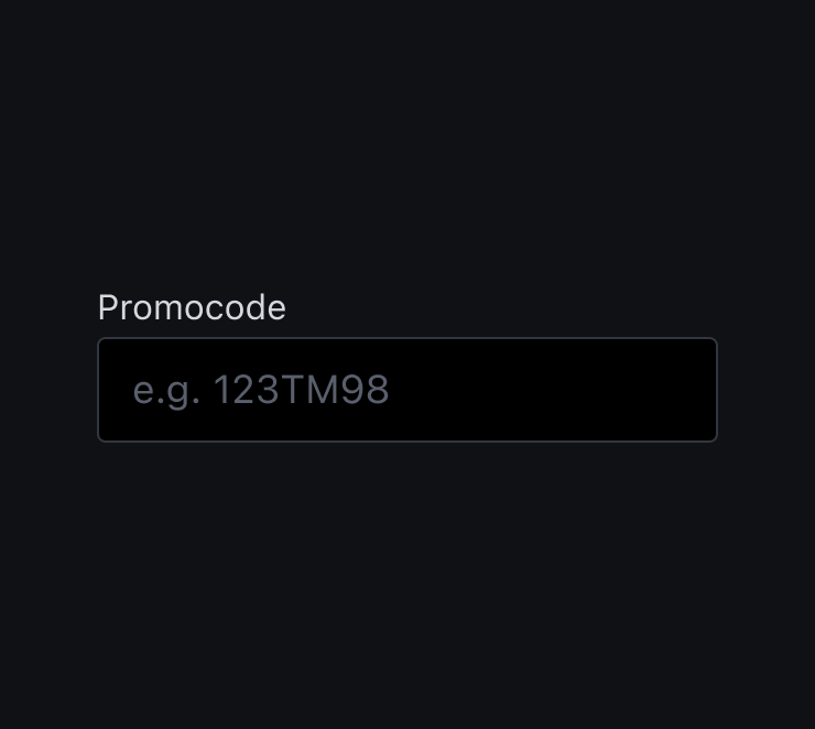
Placeholders
Placeholder text is not required for simple fields, but it can be extremely valuable for fields that require data in a specific format. Pay attention that the placeholder doesn't look like a real value.

Don't
Do
Masks can also simplify the experience, automatically formatting the data provided by the user. When a value is displayed in chunks, it makes it easier to find and correct a typo.
Always provide a keyboard type that matches the data you're asking for. Usually, seven input types are relevant to form design:
- text - normal keyboard
- email - normal keyboard with @ and .com
- tel - numeric 0-9 keyboard
- number - keyboard with number and symbols
- date - native device's date selector
- datetime - native device's date and time selector
- month - native device's month and year selector
Typing has a high interaction cost from a user's perspective, it's error-prone and time-consuming, even with a physical keyboard. These features can come in aid:
- Autocomplete
- Autocapitalize: excellent for names and street addresses, avoid it for password fields
- Autocorrect: good for chats, avoid for names, street addresses, passwords, etc.
- Auto-filling of personal details: when possible use the function for filling fields based on previously entered values.
Labels
The golden rule for labels is to keep them short, meaningful and visible. Indeed, writing clear and concise labels helps the user to quickly scan the form.
Describe fields with label
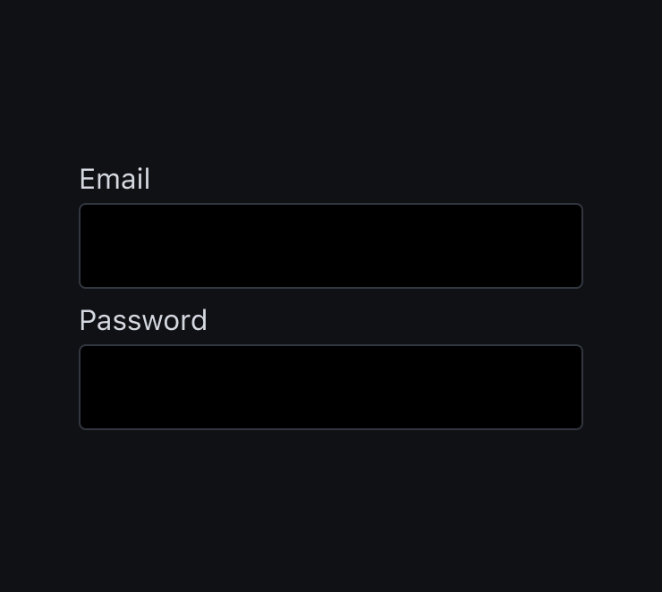
Avoid relying on placeholders as input label. It becomes a big deal when coming to forms that have a lot of fields other than being not accessible.
Don't
Do
Labels sentence case
Use sentence case for labels. While the difference in short labels is negligible, in longer labels is easier and faster to read.
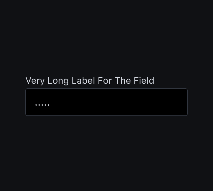
Don't
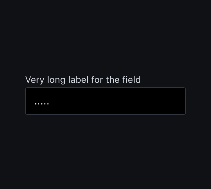
Do
Actions
Use just one clear and accessible action per form. If a secondary action is necessary or possible, prioritize the actions.
Don't
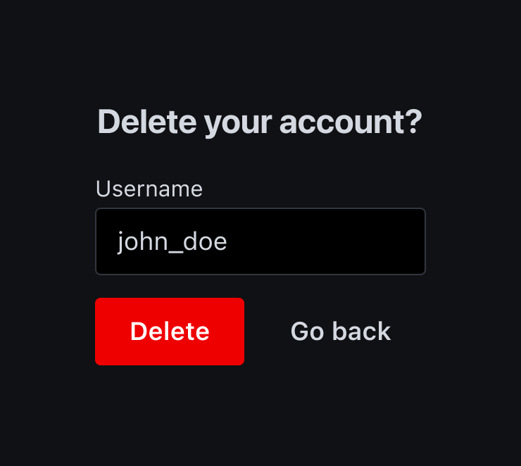
Do
Provide feedback when an action is in progress, and disable the button to prevent users from accidentally tapping it again.
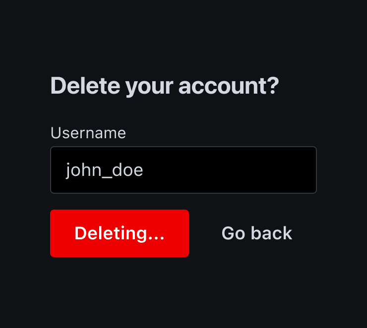
Don't
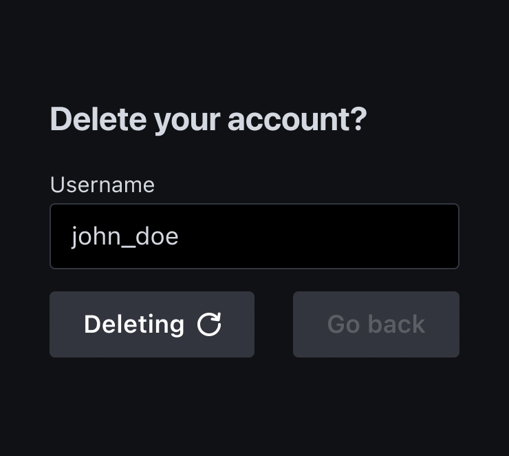
Do