design
Typography
God is in the kerning
Product text styles
Wonderflow types styles are grouped into four categories: display, headings, tagline and body. Each category comes with a default set of variants, as well as a range of options that allow for flexibility within the user interface. By using a single scale for all variants our type styles can be applied seamlessly across all screen sizes, enabling a coherent and cohesive user experience.
Typefaces
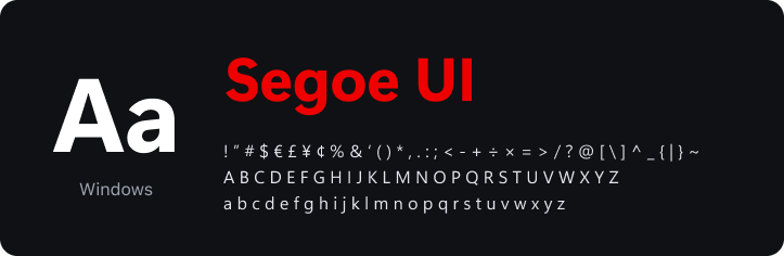
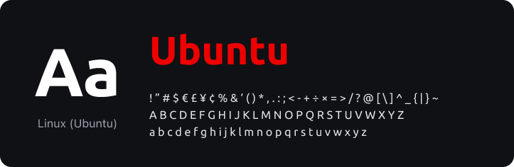
We want our digital products to feel seamless and natural to users. That's why we use system fonts, which adapt to the operating system being used. This way, the typeface matches the look and feel of other native applications, helping our product blend in with the rest of the user's system.

Font family
Wonderflow’s font families are composed of two typefaces: sans-serif and mono. Each is designed for a specific function that is core to the Wonderflow brand.
Display sans-serif
for editorial & marketing headlines
Text sans-serif
for UI text
monospace
for code
Typographic scale
Our font-sizes are based on the Minor third scale with a base font size of 16px. Each size is multiplied or divided by 1.2 from the previous size, starting with the base size, and rounded to a multiple of 4px.
Wonderflow
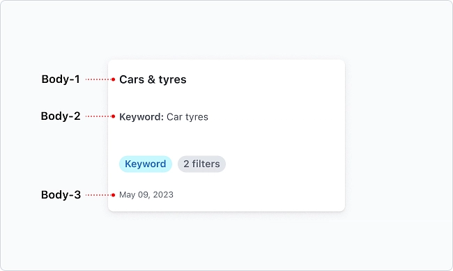
body-3
Wonderflow
body-2
Wonderflow
body-1
Wonderflow
subtitle-2
Wonderflow
subtitle-1
Wonderflow
tagline-3
Wonderflow
tagline-2
Wonderflow
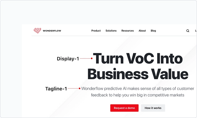
tagline-1
Wonderflow
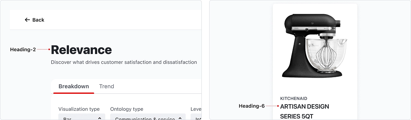
heading-6
Wonderflow
heading-5
Wonderflow
heading-4
Wonderflow
heading-3
Wonderflow
heading-2
Wonderflow
heading-1
Wonderflow
display-4
Wonderflow
display-3
Wonderflow
display-2
Wonderflow
display-1
Font Weight
Font weights in typography can enhance the hierarchical structure and draw attention to important content on a surface. We recommend using Heavy, Bold, Medium, Regular and Light weights to support most use cases.
Light
300
Wonderflow
--wds-font-weight-light
Regular
400
Wonderflow
--wds-font-weight-regular
Semibold
600
Wonderflow
--wds-font-weight-semibold
Bold
700
Wonderflow
--wds-font-weight-bold
Heavy
800
Wonderflow
--wds-font-weight-heavy
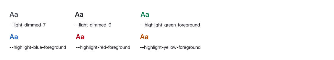
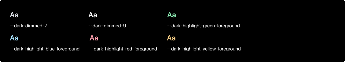
Text Color
Our default text colour is light-dimmed-color-7. You may adjust the text colours using the recommended colour tokens that correspond to pre-defined colour values. This ensures that the text remains easily readable and has appropriate contrast against different background colours.
Light backgrounds
When placing text on a light background, all type should use the following colour values:
Dark backgrounds
When placing text on a dark background, all type should use the following colour values:
Line Length
The readability of paragraphs can be influenced by the line length. It is recommended to have between 40 to 64 characters per line. This creates easy-to-read paragraphs with optimal readability.

Alignment
Our recommendation is to use left alignment when styling UI copy in left-to-right languages. This creates a more visually consistent design and enhances the reading experience by highlighting the content hierarchy.
Relevance
Learn what drives the satisfaction and dissatisfaction of customers.
- Left align text
Relevance
Learn what drives the satisfaction and dissatisfaction of customers.
- Right align text for right-to-left languages
When to center
While centering text may not always be the most effective approach for information design and legibility, it can be appropriate in certain contexts such as with an empty state, card or under an image if the amount of content is small.
Relevance
Learn what drives the satisfaction and dissatisfaction of customers.
- Center align text
Type styles
Our type styles are organised into three groups: Display, Heading and Body. They use one scale, allowing for easier application across a variety of screen sizes.
Display
Our type scale includes four display styles that are intended for editorial or marketing use. They work best on large screens.
Headings
Heading styles are used to establish hierarchy on a page by varying in size and weight. By combining different styles can differentiate content and help guide users through a page.
Body
Body text is available in three different sizes. Use body text for longer page content.

Responsive
Display and heading styles are responsive and will change size at different breakpoints. Heading-6, tagline-3 and body styles will remain the same size regardless of breakpoint.
Tokens
font-family
| Token | CSS Property | Value |
|---|---|---|
| --wds-font-family-sans | font-family | system-ui, sans-serif |
| --wds-font-family-mono | font-family | monospace |
font-size
| Token | CSS Property | Value |
|---|---|---|
| --wds-font-size-12 | font-size | 12px/0.75rem |
| --wds-font-size-14 | font-size | 14px/0.875rem |
| --wds-font-size-16 | font-size | 16px/1rem |
| --wds-font-size-20 | font-size | 20px/1.25rem |
| --wds-font-size-24 | font-size | 24px/1.5rem |
| --wds-font-size-28 | font-size | 28px/1.75rem |
| --wds-font-size-32 | font-size | 32px/2rem |
| --wds-font-size-40 | font-size | 40px/2.5rem |
| --wds-font-size-48 | font-size | 48px/3rem |
| --wds-font-size-56 | font-size | 56px/3.5rem |
| --wds-font-size-68 | font-size | 68px/4rem |
| --wds-font-size-80 | font-size | 80px/5rem |
| --wds-font-size-96 | font-size | 96px/6rem |
font-weight
| Token | CSS Property | Value |
|---|---|---|
| --wds-font-weight-heavy | font-weight | 800 |
| --wds-font-weight-bold | font-weight | 700 |
| --wds-font-weight-semibold | font-weight | 600 |
| --wds-font-weight-regular | font-weight | 400 |
| --wds-font-weight-light | font-weight | 300 |
letter-spacing
| Token | CSS Property | Value |
|---|---|---|
| --wds-letter-spacing-0 | letter-spacing | 0 |
| --wds-letter-spacing-16 | letter-spacing | 0.01rem |
| --wds-letter-spacing-24 | letter-spacing | 0.015rem |
| --wds-letter-spacing-32 | letter-spacing | 0.02rem |
line-height
| Token | CSS Property | Value |
|---|---|---|
| --wds-line-height-16 | line-height | 16px/1rem |
| --wds-line-height-20 | line-height | 20px/1.25rem |
| --wds-line-height-24 | line-height | 24px/1.5rem |
| --wds-line-height-28 | line-height | 28px/1.75rem |
| --wds-line-height-32 | line-height | 32px/2rem |
| --wds-line-height-36 | line-height | 36px/2.25rem |
| --wds-line-height-40 | line-height | 40px/2.5rem |
| --wds-line-height-48 | line-height | 48px/3rem |
| --wds-line-height-56 | line-height | 56px/3.5rem |
| --wds-line-height-64 | line-height | 64px/4rem |
| --wds-line-height-80 | line-height | 80px/5rem |
| --wds-line-height-96 | line-height | 96px/6rem |
| --wds-line-height-108 | line-height | 108px/6.75rem |
Resources
Check the resource page to download all the Wonderflow's assets.