design
Colors
The way we evoke reactions and emotions
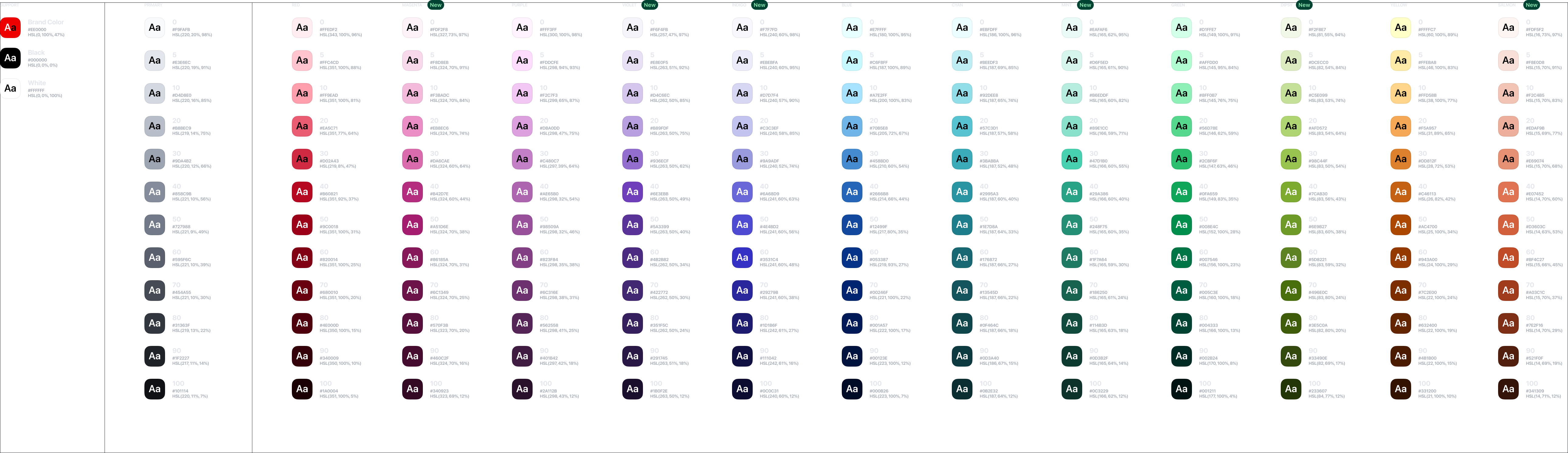
Our color system was designed to establish a flexible range of colors that support our brand, comms, and product teams. Wonderflow products relies on a full ranged color palette which includes ten shades for each color.
Wanda provides a full-featured color collection as tokens. Each color is carefully defined to match the contrast criteria.
Support
The support palette is meant to include all the secondary colors which are commonly used across the design but without being part of a color scale.
brand
#e00000
black
#000000
white
#ffffff
Primary
The primary palette includes the main and the most used color across the brand and digital products. These colors are ofter combined with the support-brand color which is used as accent.
0
#f8f9fa
5
#e3e6ec
10
#d2d6de
20
#b6bcc8
30
#9da4b2
40
#838a9a
50
#717888
60
#595f6d
70
#444954
80
#30353f
90
#1f2227
100
#0f1013
Literal colors
These basic color tokens can be used for multiple purposes and they don't have a specific meaning.
0
#ffeaf0
5
#ffc1ca
10
#ff9eac
20
#e95c71
30
#cf2a43
40
#b50721
50
#9e0017
60
#7f0013
70
#66000f
80
#4c000c
90
#320708
100
#190303
0
#d1ffe7
5
#affccf
10
#8eefb7
20
#55d78d
30
#2bbf6d
40
#0fa356
50
#008e4c
60
#077546
70
#005b3d
80
#004232
90
#002822
100
#051413
0
#e5ffff
5
#c6f8ff
10
#a8e2ff
20
#6eb2e7
30
#4389d0
40
#2666ba
50
#1148a0
60
#043184
70
#072370
80
#001a56
90
#00113d
100
#000a23
0
#fff4ff
5
#fcdcfd
10
#f2c8f3
20
#dba1dd
30
#c37fc7
40
#ac64af
50
#984f9a
60
#803e82
70
#6b316d
80
#582559
90
#3f1a41
100
#2a112b
0
#ffffc6
5
#ffeaa8
10
#ffd389
20
#f5a856
30
#dd8130
40
#c25f13
50
#ad4800
60
#933b00
70
#7a2c00
80
#602300
90
#4c1c00
100
#321107
0
#eafcff
5
#beecf3
10
#91dde7
20
#56c2d0
30
#3aabba
40
#2894a3
50
#1e7d8a
60
#176772
70
#13545d
80
#0f464c
90
#0d393f
100
#0b2e32
0
#fcf1f7
5
#f8d7eb
10
#f2b9db
20
#eb8ec5
30
#da6cae
40
#b32c7d
50
#a41d6e
60
#86175a
70
#6c1348
80
#570e3b
90
#450b2e
100
#340922
0
#eafaf6
5
#d5f5ed
10
#b5ecde
20
#89e0cc
30
#47d1b0
40
#28a386
50
#238e74
60
#1f7963
70
#17624f
80
#104639
90
#0b362c
100
#092921
0
#fcf4f1
5
#f8e0d7
10
#f1c4b5
20
#ecb09b
30
#e69074
40
#e07251
50
#d25e3b
60
#be4c27
70
#a03d1c
80
#7d2e16
90
#511e0f
100
#341309
0
#f6f6fc
5
#eaeaf9
10
#d6d6f4
20
#c2c2ee
30
#9a9adf
40
#6968d9
50
#4d4bd2
60
#3530c3
70
#28269b
80
#1c1a6e
90
#100f41
100
#0b0b31
0
#f2f8e7
5
#dcecc0
10
#c4df99
20
#aed471
30
#8cc039
40
#7bab30
50
#6e9b26
60
#5d8220
70
#486e0c
80
#3d5b0a
90
#33480d
100
#233607
0
#f5f3fa
5
#e8e0f5
10
#d3c5eb
20
#b79fdf
30
#926dce
40
#6e3ebb
50
#5a3399
60
#4b2b82
70
#422771
80
#351e5b
90
#281644
100
#1a0e2e
Themes
Themes serve as an organizational framework for color in Wanda, with each theme based on a specific combination of colors. There is a default “light” theme and a default “dark” theme. The light theme uses support-white as background and primary-70 as global foreground, and the dark theme uses support-black as background and primary-5 as global foreground.
It's important to use colors from themes whenever possible to keep consistency across products and to allow users to switch the theme based on the situation or system settings.
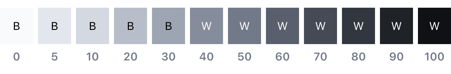
Accessibility
Using various forms of contrast is the most important consideration when making user-friendly color and interface choices. Awareness of standards and best practices is the key to accessible color selection.
The color families in the Wanda palette contain twelve values from 0 to 100, with a single half-step of 5. Black text is WCAG AA accessible on colors ranging from 0 to 30 while white text is accessible on colors from 40 to 100.
Color contrast and readability
Beyond black and white, the Wanda color palette provides a range of accessible combinations. Subtracting the foreground value from the background value (or vice versa) helps determine whether that color combination meets the WCAG AA contrast ratio success criteria. If the difference between two values is 50 or greater, the colors are accessible. Anything below a difference of 50 may fail accessibility standards. This method is useful only if the size of the font is 18px or greater.