layouts
Product Card
A features rich card for products
Features
- Product Image Gallery
- Overlay Actions
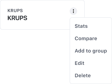
- Header Menu Actions
- Clickable
Overview
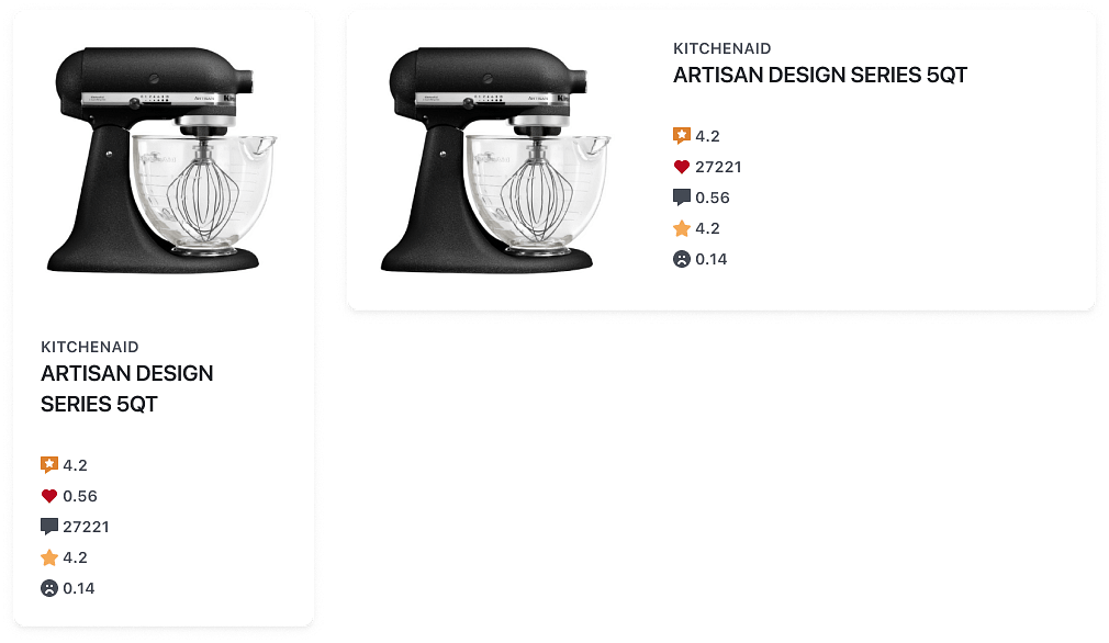
ProductCard is a variant of the Card component that displays product information. There are four core sections — Media, Header, Kpis and Footer. Each of these sections can hold the pre-styled subcomponents (images, title, subtitle and actions) or other content including text, buttons and links.
Branding
Product Card labels will be displayed on three lines by default
4.30
123
0.51
Anatomy
import { ProductCard, Menu } from "@wonderflow/react-components";

export default () => {
  return (
    <ProductCard
      subtitle="Branding"
      title="Product Card..."
      source={['https://...']}
      rating={4.3}
      sentiment={0.51}
      feedbackCount={123}
      footer="27 Apr 2023"
      menuActions={<Menu>...</Menu>}
      />
  );
};Usage guidelines
The product Card is most often used inside the main content area. Cards in a grid should be the same height.
Best practices
- Product cards should group related information.
- Use product cards to display content and actions on a single topic.
Features
Orientation
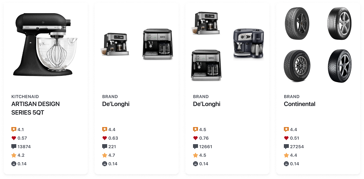
Cards can have a vertical or horizontal image orientation.
Media
Card images are specifically designed to maintain the aspect ratio while filling the width of the card. This ensures that the images are displayed proportionally and avoids any distortion or stretching. Card media can accommodate up to four cards.
Header
The Card header serves as an area to display a title, optional subtitle and actions that are relevant to the entire card. In situations where additional actions are present, we utilise a Menu to accommodate them.
For the Title, we recommend a maximum of three lines, with a minimum height of 84px. As for the subtitle, it is recommended to keep it to a single line.
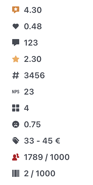
KPIs
Cards content most commonly displays the product KPIs such as Rating, Feedback count and Sentiment Index. We recommended showing a maximum of three KPIs.
API Reference
ProductCard
directionenumverticalborderedbooleanfalsehighlightOnHoverbooleanfalsesourceArray<string>[]ratiostring1/1titlestringsubtitlestringtitleRowsnumber3ratingnumbernpsnumberfeedbackCountnumbervotesRatingnumbervotesCountnumbersentimentnumbertgwnumberpriceMinnumberpriceMaxnumbercurrencyenumEURcurrencyDecimalsnumber0groupsnumberusersnumberusersCapnumberskusnumberskusCapnumberkpiItemsnumber3kpisRowGapTokensTypes['space']8overlayActionsReactNodeonClickFunctionisLoadingbooleanfalsechildrenReactNodeProductCard.Media
sourceArray<string>[]ratiostring1/1isLoadingbooleanfalseProductCard.Header
titlestringsubtitlestringdescriptionstringtitleRowsnumber3descriptionRowsnumber3isLoadingbooleanfalseProductCard.Kpis
ratingnumbernpsnumberfeedbackCountnumbervotesRatingnumbervotesCountnumbersentimentnumbertgwnumberpriceMinnumberpriceMaxnumbercurrencyenumEURcurrencyDecimalsnumber0groupsnumberusersnumberusersCapnumberskusnumberskusCapnumberkpiItemsnumber3kpisRowGapTokensTypes['space']8isLoadingbooleanfalse