design
Brand
Wonderflow's digital identity
Wanda relies on the Wonderflow's design language and principles and it helps designers and developers to keep brand consistency across projects and design assets. There are many resources shared across the teams like company logos, assets and icons. Here you can find everything related to the Wonderflow brand.
Anatomy
Optical kerning, refined weight and defined clear space, as well as delineated placement in relation to other content help to make it as instantly recognizable as possible at all sizes and in all contexts.
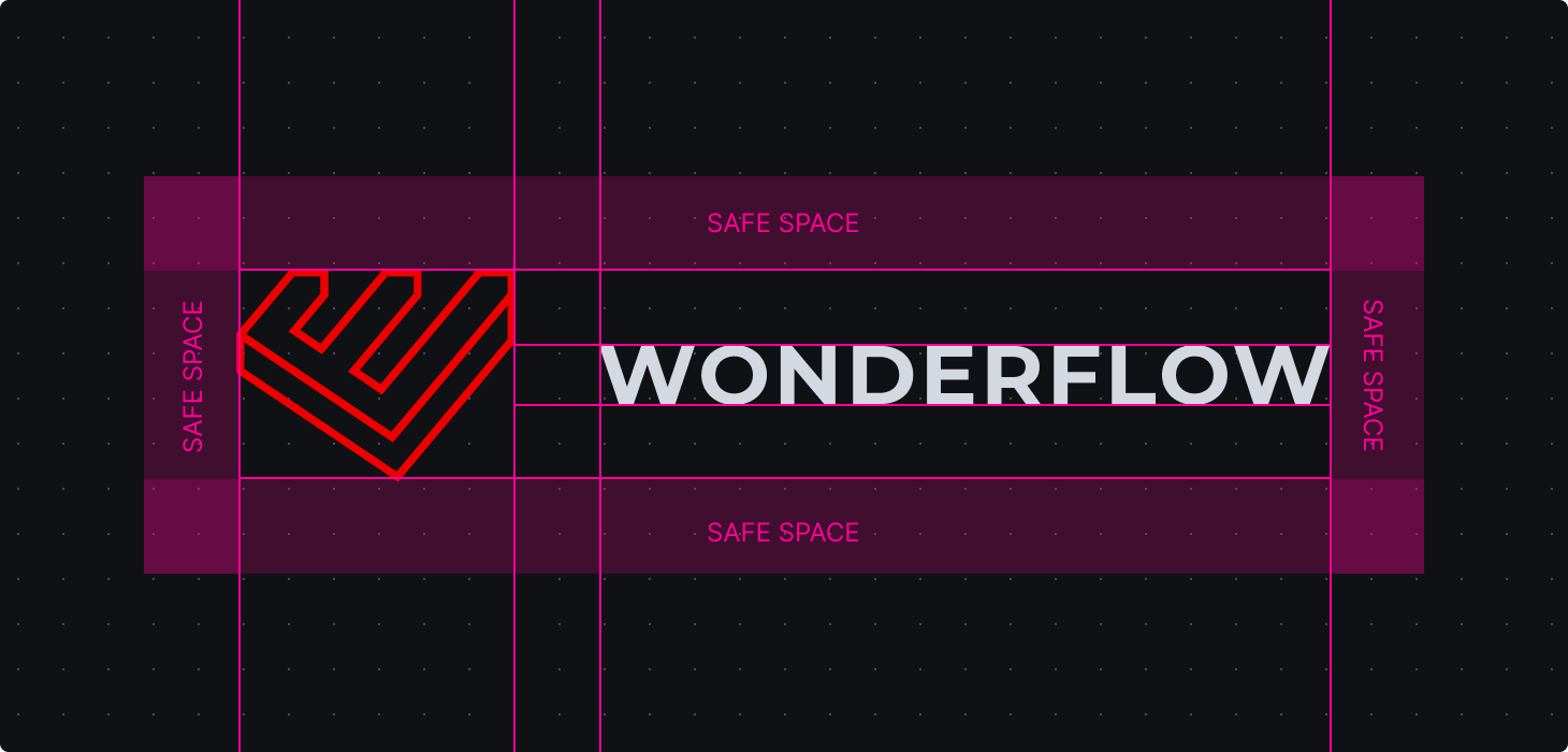


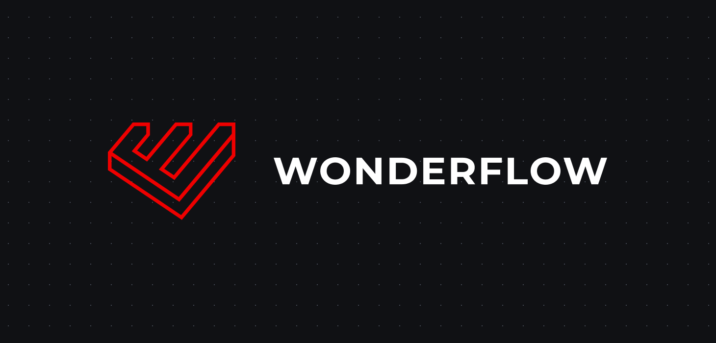
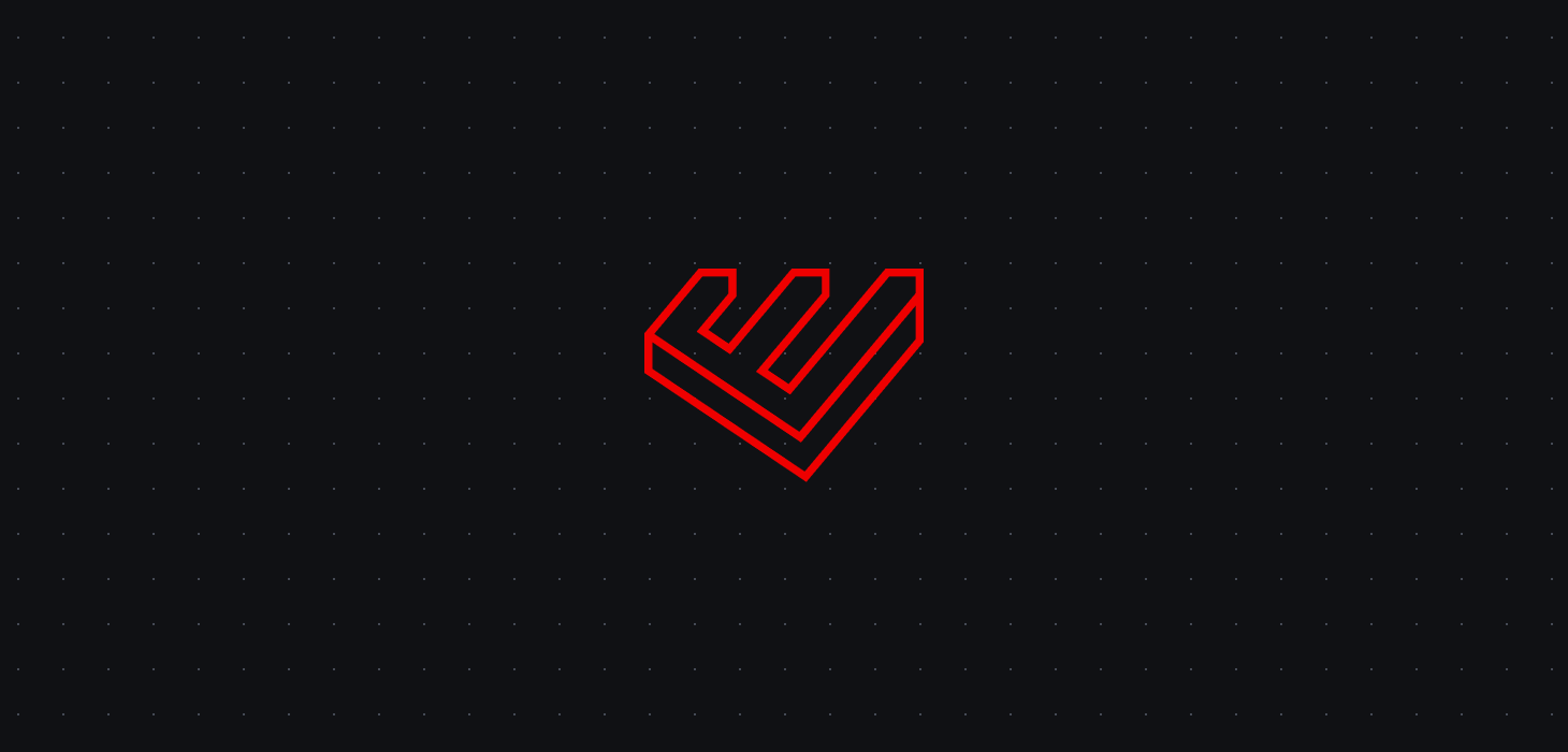
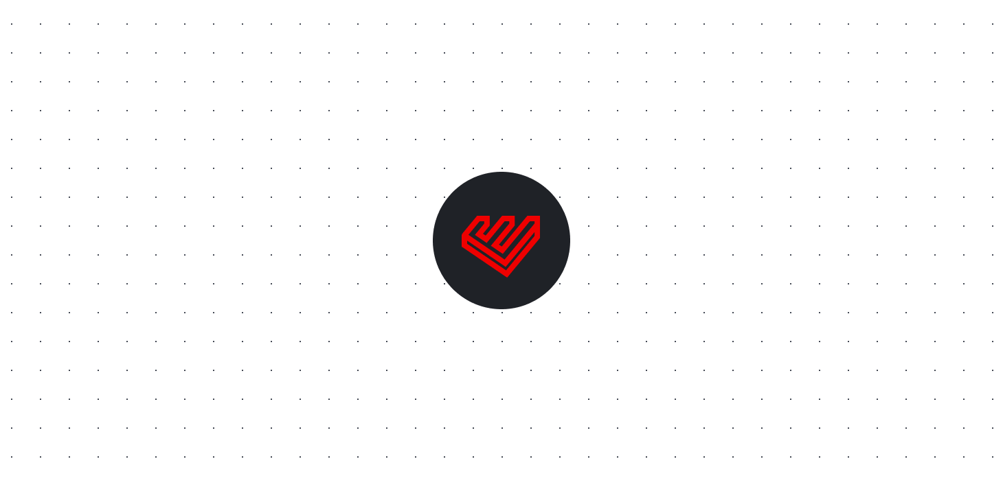
Logo formats
At Wonderflow we use three different version of the company logo based on the situation.
Full
The full logo is used when the brand communication is strong and prominent. It needs a big white space area around in order to keep the information readable.
Mark
The mark logo is often used when the brand identity should not be so prominent and when there is not enought room for the full logo.
Icons
Icons are versions of the mark logo. The stroke is thicker in order to keep readability on really small sizes. They are used as tab icon inside web pages.
Resources
Check the resource page to download all the Wonderflow's assets.